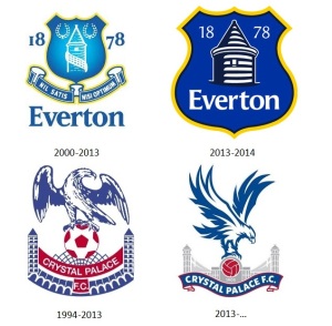
Everton Football Club’s redesigned badge was greeted with near-universal disapproval. A poll on one Everton fans’ website, Toffee Web, indicated that 91% of 12,369 fans either disliked or hated it. The frustrations mainly came about because the new badge ditches the characteristic laurel wreaths and the club’s historic Latin motto, “Nil Satis Nisi Optimum”, but also because of aesthetic changes – the broader shape and the thick yellow outline.
Evertonians expressed their distaste in the form of a petition which has since gathered almost 24,000 signatures. The legendary Everton goalkeeper Neville Southall declared to his 32,000 followers on Twitter that “the new badge is crap” and even the Mayor of Liverpool, Joe Anderson, announced it was “not good enough”. The fan backlash soon succeeded; the club confirmed that the new crest would only be used for one season whilst a new one would be designed to replace it. But the concerns of Everton fans were not easily allayed. For many, this episode had revived questions about the board’s competence only weeks before they would appoint the successor to David Moyes’ 11 year reign as the over-achieving manager of the club.
Crystal Palace FC had also introduced a redesigned crest near the end of this season. In stark contrast, a fan poll on the CPFC BBS concluded that 90.59% of supporters liked the new badge, showing remarkable support for a move which is always bound to be controversial to some fans.
Interestingly, both Crystal Palace and Everton shared the same reasons for changing the club crest. When Crystal Palace co-chairman Steve Parish was interviewed at the Player of the Year awards night, he said “the badge that we had was a line-drawing from the seventies or the eighties and it just doesn’t reproduce very well, it tends to look like a mess on the kit when it’s embroidered”. On their official website, Everton FC also cited the poor reproduction of their crest as a reason to change it: “The previous version of the Crest – created 13 years ago – was often misrepresented, suffering regularly from the omission of key elements like our name and our year of formation. As technology marches on, those challenges have increased. On television, on websites, on mobile devices, the Crest was far too often badly reproduced.”
Parish also admitted that a change was needed because Palace’s old badge appeared “tired and old-fashioned”, saying the new crest has a “modern and more up-to-date feel”. Everton showed a similar desire for a modernised crest: “Our team carries a responsibility to maintain a refreshed and relevant identity for the Club”.
The reasons given by the two clubs – modernisation and a crest which is easier to reproduce – show that they are keenly aware of the importance of brand identity in football. A crest which can be easily printed or embroidered on merchandise gives the club a much stronger brand image, and consequently more recognition. These reasons reinforce the fact that modern clubs can no longer afford to only focus on their local community, but must also attract fans across the globe in order to ensure their survival through the cut-throat commercialism of the Premier League era.
“Our new Club Crest combines four historic elements of the outgoing Crest – the Tower, the shield, our name and the year of our formation – to form a concise, modern and dynamic representation of Everton” reads one sentence on the Everton website, trying to validate the redesign. Evidently, the fans do not agree that those four elements were the most important. This leads to the question, what parts of the badge are most important to supporters and why?
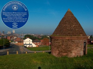
The most recognisable elements in Everton’s old badge have their origins in a club crest designed by Theo Kelly, then the club secretary, in 1938. The centrepiece of Everton’s crest has been Prince Rupert’s tower. Ken Sweeney, chairman of the Mid-Cheshire Everton Supporter’s Group was quoted on the official club website as saying, “To me, the Tower is everything, the Tower is Everton. It represents Everton Football Club; that is so important to Evertonians. Every badge has had the Tower on except when it was just ‘EFC’.” This depth of feeling may seem curious to some, as the building was used in the past by Parish Constables to lock up drunks and petty criminals. What may explain the close link between the club and this building is that it is the oldest surviving building in Everton, having stood on Everton Brow since 1787. A plaque on the tower proudly reads, “When the successful local chapel team took the name ‘Everton’, this well-known landmark was adopted as the Everton Football Club insignia”.
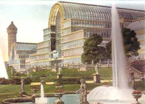
The building on Palace’s crest may appear to be just a rather elegant greenhouse. In fact, this was the home of the Great Exhibition of 1851, an event to convey Britain’s prestige as a world power in the days when the Sun never set on her Empire. Exhibits hailed from all over the world, and recorded attendances were as high as 109,915 in a day. The palace itself was relocated to Sydenham Hill in 1854, and was considered the defining landmark of South London until its destruction by fire in 1936. Its loss was proclaimed as the “end of an age” by Winston Churchill, who witnessed the fire.
The link between these two buildings then is an issue of local pride; one as the oldest building in Everton, the other as a once world-famous landmark of South London. Supporting a football team is often an issue of local pride, and concepts such as fans mostly hailing from the local area and local boys rising through the ranks of the youth academy to play for the first team are still seen as idealistic by many supporters.
Another theme consistent with both badges is the date of foundation. Crystal Palace introduced it to their crest for the first time in their history, whilst Everton’s was moved from the periphery of their old badge into a more prominent position in the new one.
Their foundation in 1878 marks Everton as one of the oldest clubs in the Premier League. It is worth remembering that in footballing terms, 1878 was only six years after the first ever final of the FA Cup – the oldest football competition in the world – was held, and it would still be ten years until William McGregor founded the Football League.
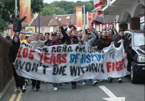
Crystal Palace’s date of foundation may be more recent but the fans still show pride at the club’s longevity, as shown in 2005 when centenary shirts were released, and a sell-out commemorative friendly fixture was played against Inter Milan. At a protest in 2010 outside Lloyd’s bank when the club was staring down the barrel of liquidation, one banner read: “105 years of history won’t die without a fight”.
The date of a club’s foundation is of course crucially important to its history because it tells us how long the club has endured, how many family generations the team has been supported by and where the nature of the club’s traditions originate from.
A lot of the ire about Everton’s new badge was concentrated at the fact it removed the motto “Nil Satis Nisi Optimum”, which translates from Latin as “nothing but the best is good enough”, along with the omission of the two laurel wreaths, symbols used since the Olympics of ancient Greece to signify a victorious athlete. The much-publicised petition opens with the line “Keep the wreaths and motto of Everton Football Club”. Some cynical fans saw their removal from the crest as evidence of their club’s diminished stature; a club which once challenged for league titles and competed in European competitions now reduced to struggling for sixth place, having been without a major trophy in almost two decades.
It is interesting that both Arsenal and Tottenham Hotspur also removed their Latin mottos from the crest in recent redesigns, giving weight to the idea that designers and executives may consider these phrases to be ‘out of touch’, or ‘too old-fashioned’. However, Spurs’ motto (Audere Est Facere) was only introduced in 1956, whilst that of Arsenal (Victoria Concordia Crescit) was adopted in 1949, the idea actually coming from the editor’s programme notes. Therefore, neither had quite the same gravitas as Everton’s motto, which was their founding principle 1878.
The very fact that the motto Everton FC was founded on has endured 135 years shows how it has shaped the club’s outlook and attitudes. More than just a motto, it could even be seen as the club’s raison d’être. It is easy to understand why fans are so keen to preserve this defining characteristic. As Tony Abbott, chairman of the Everton Fans’ Forum said, “We all have it in our hearts and minds; in our DNA.”
However, the eagle that dominates Crystal Palace’s badge is not of any local importance or even particularly old. The eagle insignia of Portuguese footballing giants Benfica was the inspiration, and its first appearance on Crystal Palace’s badge dates from 1973, the same year in which the red and blue stripes were first seen on the kit. Putting that in context, it was introduced in the same year that Kevin Phillips, scorer of Palace’s winning goal in their recent play-off final, was born. This rebranding of the club seems to have been well received by the fans, with “Eagles” having effectively replaced the club’s former nickname “The Glaziers” to the extent that a badge without an eagle would be virtually unthinkable. This could suggest that tradition and history are not essential elements for a club crest after all, and it is indeed possible for style to triumph over substance in the eyes of the fans.
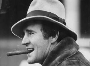
In fact, the reason that the eagle won over the fans was probably due in no small part to the charismatic manager who introduced it, Malcolm Allison. “Big Mal”, as he liked to be known, was a Fedora-wearing, cigar-smoking eccentric who remains to this day extraordinarily popular amongst the Palace faithful. I say “extraordinarily popular” because this man led the team to two consecutive relegations yet is still revered as a hero. But whilst he may not have revived the club’s fortunes on the pitch, he certainly made them the centre of media attention, attracting all sorts of newspaper headlines with his witty remarks. As Crystal Palace’s record appearance maker Jim Cannon said, “Malcolm Allison put Palace on the map. No other man could single-handedly take a club from the First Division to the Third Division and still become an instant hero”. The eye-catching bright red and blue stripes of the new kit and the eagle (both of which have remained steadfastly associated with the team since his departure) are his living legacy to the club. This is why the fans hold them dear.
So far, these two situations seem remarkably similar. The clubs shared the same reasons for wanting a redesign, and fans had strong feelings towards aspects of the club crest for similar reasons of history and local pride. What is also consistent is that the clubs did not want drastic change to their badges and even recognised the value of history to supporter, as the Everton website says, “We recognised the need to do this with diligence and sensitivity – with one eye on the past but also one eye on the future. We researched our history, we reviewed the evolution of our Crest…” Steve Parish echoes this by saying “I see this change as more evolution than revolution, as it was important to keep the heritage of the past.” However, the place where the clubs’ approach markedly differs is in the level of fan consultation.
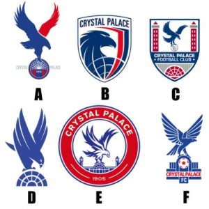
As early as 2010, the Crystal Palace board had mooted changing the crest. Various graphic designers were consulted and six designs were drawn up. These were presented to season ticket holders to vote for the new crest. This may well seem like the ideal way in which to decide on a new crest, but in fact the result was that all crests were panned by supporters and the board were no further forward.
Steve Parish instead took inspiration from popular fan-made designs, saying, “The designs the fans put out online, we took them all to a designer, and there was one guy on the BBS called Dan who really designed it to my brief.” The finished product was revealed at the Player of the Year awards night at the end of the 2012/13 season, to rapturous applause. As well as the fans’ delight, Parish confirmed that it had fulfilled his original criteria: “This new design will re-produce much better than the old line drawing, featuring a stronger more dynamic eagle that brings our club image into the 21st Century”.
Meanwhile, Everton designed their new badge behind closed doors. The Everton website at first claimed the crest was designed “following an extensive consultation process with fans, supporters’ groups and branding experts.” When fans hotly disputed this, Everton’s chief executive Rob Elstone eventually conceded that “Our chairman had demanded widespread consultation and we stopped short of that”. But a lot of damage had already been done. Whilst the chairman may no longer have been held personally responsible, the club’s botched redesign still attracted negative coverage in outlets such as the Mirror, the Daily Mail, the Telegraph, the Guardian, the Times and BBC News – a PR disaster for a team christened “the people’s club” by outgoing manager David Moyes.
This blog has compared the recent crest redesigns of both Crystal Palace and Everton by firstly establishing why they wanted the change; the answer to this was a more modern appearance and a crest that is easier to reproduce on merchandise. These factors are largely due to the increased need of a strong brand identity in a highly commercial league with a globalised television audience. Secondly, the reasons for the fans’ attachment to certain symbols of their club was explained, with history, tradition, local pride and even the memory of a flamboyant manager provoking strong emotional ties from supporters. Finally, the design strategy of both clubs has been contrasted, and this gives the strong impression that fan consultation (facilitated by the internet) is now necessary when a new badge must be introduced.
Input from fan designs online paid dividends for Crystal Palace, as they were able to achieve their objectives with near unanimous backing from the fans. When Everton did not take fan opinions into account, their new badge was a failure and as a result, merchandise revenue will fall, and some fans will feel disenfranchised from the club. When Everton introduce another design at the end of the 2013/14 season, they must learn from the approach of Crystal Palace in order to keep fans on their side, and to keep their heritage alive.
It is doubtful that either club would have changed their badge without reason. However, removing 135 years of history from the badge is clearly an unwise move and is prone to upset fans who obviously cherish the history of their club which so defines its identity. A club crest is so much more than just a marketing tool, because it represents the club’s history, and all that it stands for. Steve Parish is not only a football club co-chairman but also the founder and former CEO of Tag: worldwide, a design and production agency that operates internationally, so his reflections are of particular interest:
“When we started off, I did think of it in an advertising sense, as a logo. But it’s not a logo, is it?
“It’s a shield, a coat-of-arms; it’s what you wear when you go in to battle”.
